Table Page Modernization
Lead / Solo designer for Table Page, other designer for Navigation refinements
Core driver
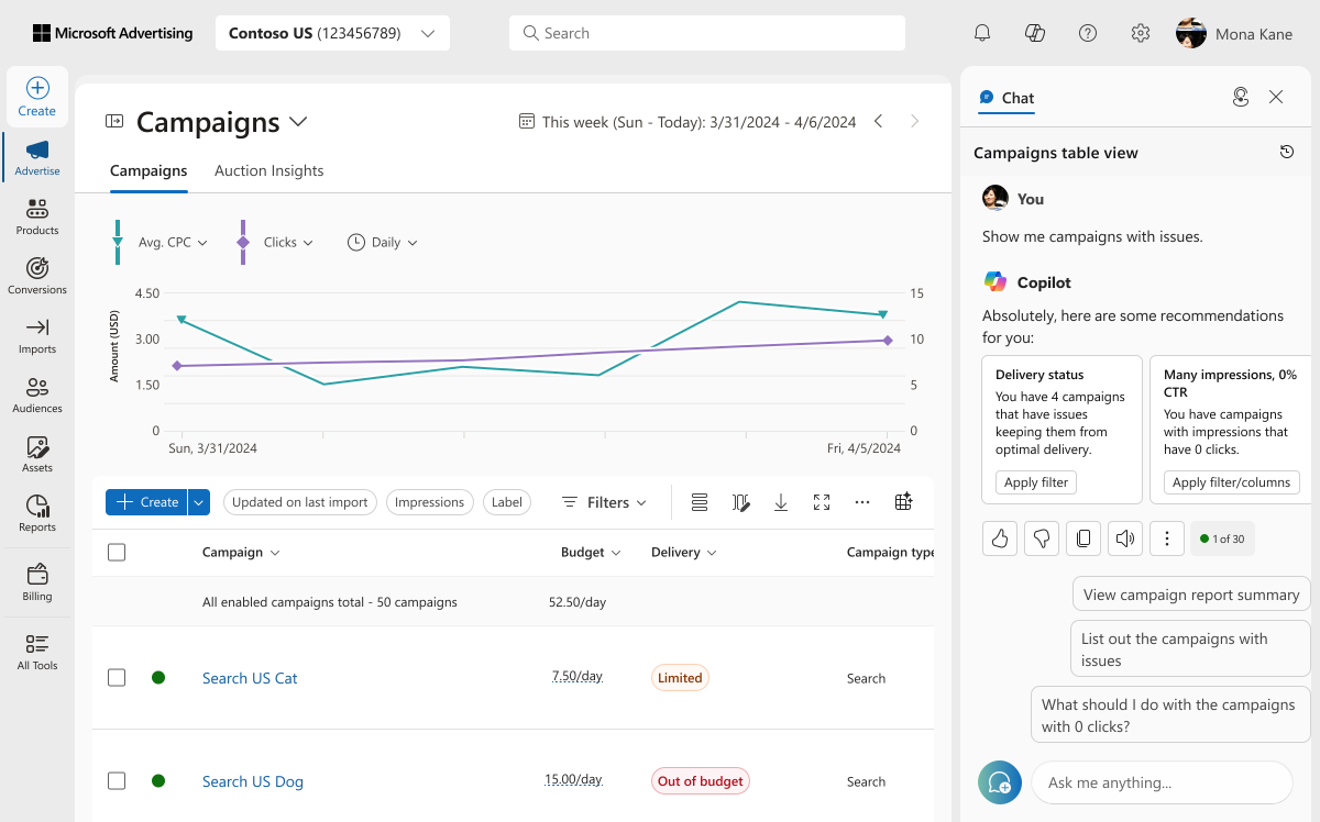
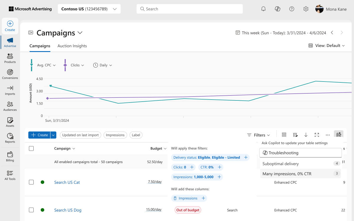
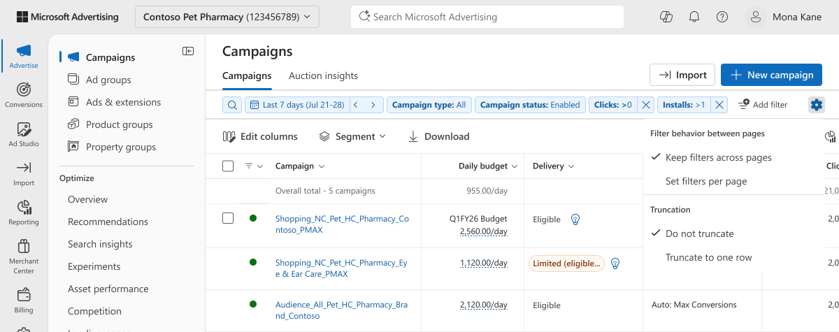
Refactor and componentize table pages based on Fluent 2 style/tokens as part of Microsoft Advertising UX Refresh initiative focused on increasing user CSAT / announcement at marketing event in Cannes for demoing new AI functionality in April 2026.
Issues discovered from audit/user DSAT
1. Visually noisy
- Color
- Alignment
- Spacing
- Typography
- Component appearances
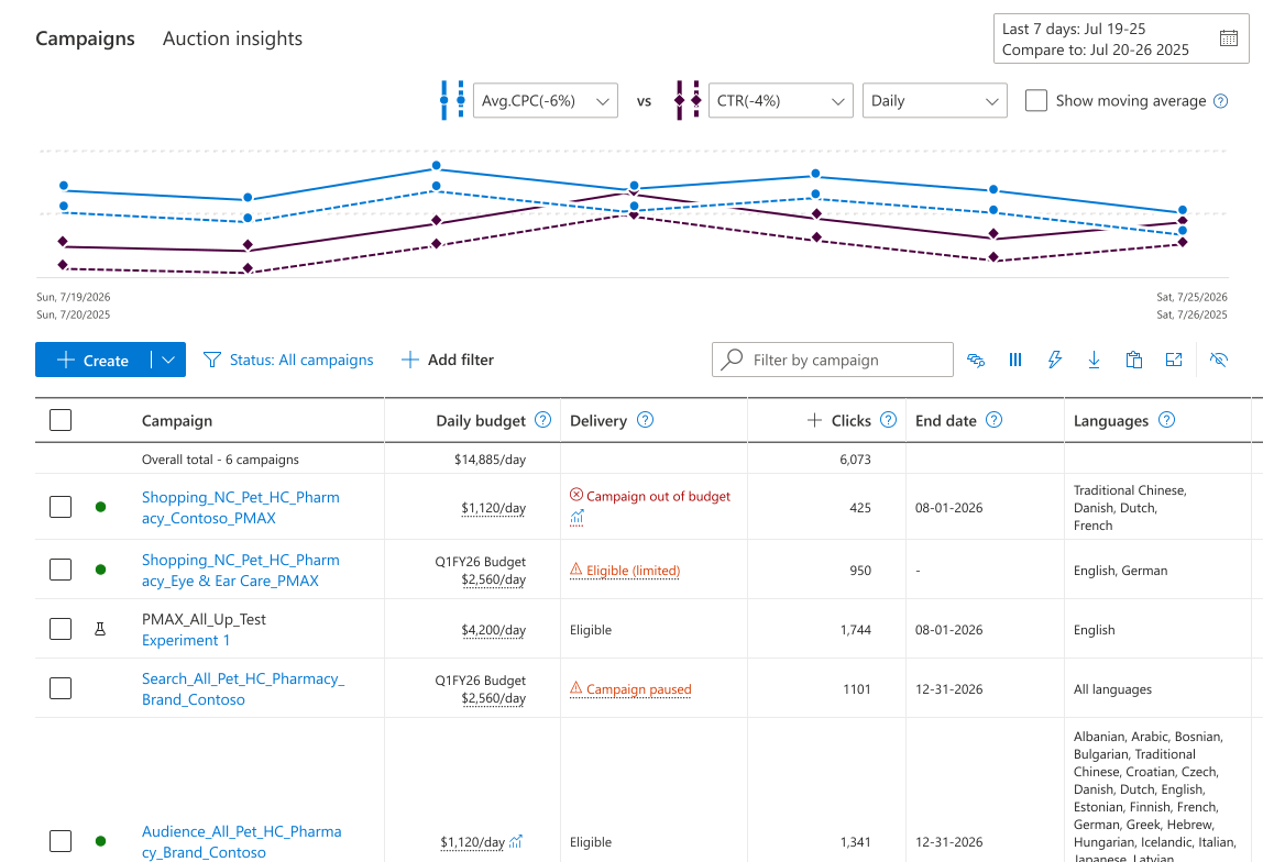
2. Interaction inconsistencies
For example, dashed underlines usage not all having hover interactions
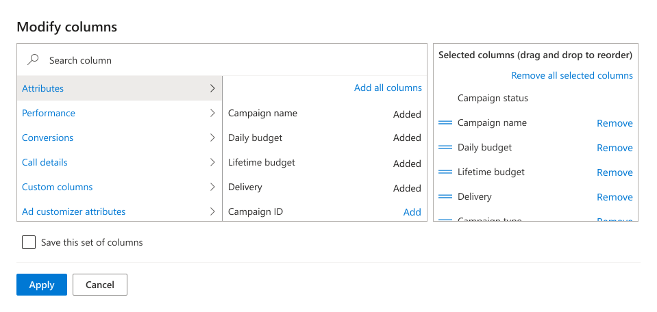
3. Editing/browsing columns UI cramped
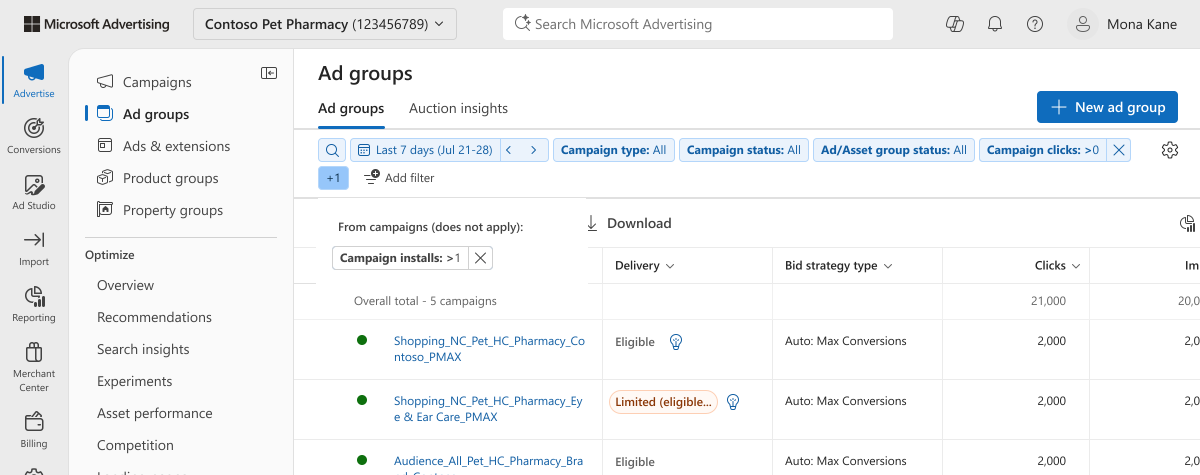
4. Filtering confusion (global vs local, separated, different visuals)

Additional goals
Maintain 70% user retention on UI before rolling out to next phase of users
Establish design-to-code alignment for components
Support theme migration for future phase
Create a solid foundation of decisions for major workflows for MAP UX Refresh rollout
Key design decisions
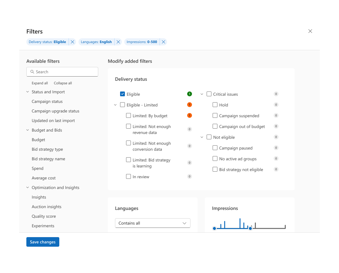
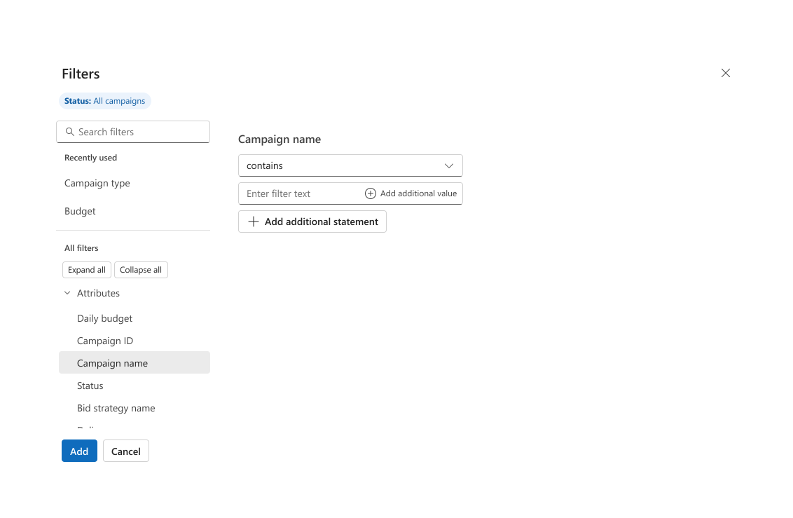
1. Consolidated filtering into a single pattern
Global and local → Non-dismissable and dismissable
Full bar space to display more applied filters, truncation toggle for user control in different situations
2. Gave column editing space
Tree component provides better browsing across groups
Interaction tag list allows for easy removal and drag and drop to reorder
3. Improved visual design of base table components
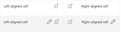
True alignment of header text with cell content, cell content with other cell content
Simplification of cell template content, interactions, actions behavior and when to use
4. Quick actions available via table header cell buttons
Allows for quick filtering as well as custom column actions
Drag and drop to reorder in page quickly
AI as a Decision-Support Tool
Evaluating complex table behaviors through static mocks alone creates blind spots in design-to-code fidelity. Many decisions are multifaceted, and reviewing all the combinations can make stakeholders' eyes glaze over. To fix this, I used AI-assisted interactive prototyping to model complex decisions, such as truncation thresholds and cell resting/hover actions. Rather than coding fully functional table components, I scoped these lightweight, mid-fi prototypes to target specific aspects to visually show trade-offs. Serving as interactive decision-support tools, they enabled stakeholders to evaluate proposed patterns in real time, provide actionable feedback, and increase speed toward a final decision.
Action Slot Grid Prototype
Configure how resting and hover actions are positioned within grid cells
Impact
72% retained adoption on new UI for internal users (80% increase from low of 40% during initial dogfood)
94.8% retained adoption on new UI for first 1% of external users
A more modern, scalable, consistent interaction framework that applies to ~80% of the products' surfaces
Components created that match code in Figma/Storybook, utilizing tokens that can be rethemed in the future